20 Beautiful Prints That Will Brighten Up Your Home

Chances are you’ve been staring at the blank walls of your home and have been dying for a way to brighten up your space.
I need inspiration! You think. Where are the pretty pictures?! And will I have to go through hundreds of pages to find something I like?
Don’t worry girl, I got you.
For those that are new to the blog (hi, hello!) and don’t know much about me — here’s a fun fact: I love art! And because of that, I know a lot about how it can completely set the mood, tone, and vibe of your entire space.
So, today I will be sharing 20 art prints I found that are perfect for brightening up your office workspace or home in general! Yes girl, I did all of the hard work for you. You can thank me later.
I will break the prints down by styles and give a little overview of why I love these types of pieces and what they pair well with (in case you’re doing a collage wall or want more than one piece).
And if you’re not too sure what type of art print will look best with your space, check out some inspo here: The Home Office Nooks We’re Loving
Let’s get started!
*This post may contain affiliate links, which means I may get a commission if you decide to make a purchase through my links.
20 Beautiful Prints That Will Brighten Up Your Home
Photorealism
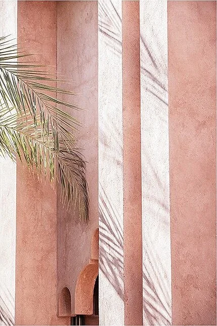
The first style of art we’re going to highlight is photorealism! This style of art focuses on detail, which sometimes makes the piece seem more real than reality, which can help bring vibrancy, color, and depth to your space.
Recently I’ve been loving realistic artwork that features terra cotta walls, leaves, oceans, and other nature- esque things. I think the combination of the colors are so pretty and can bring so much life to the room. Plus a tip if your space is dark, plants in paintings = greenery with no maintenance!
I tried to pull pieces that were neutral enough to match the majority of home decor styles, but still had a fun and bright feel to break up any empty white space.
What It Would Pair Well With
Photorealism prints actually pair really well with one another, especially if they are in the same color scheme. But they also look nice paired with word text or a minimal line artwork.
I recently purchased realism artwork for my dining room from HomeGoods! (See below!) Unfortunately, I bought it at HomeGoods, and wasn’t able to get the name - or else I’d link it for you guys. :-( But I tried to find some similar options.

Photorealism Prints round up


Abstract
The next style of art we’re going to explore is abstract art. Abstract pieces are a great way to brighten up an entire space, especially with their simplicity, structure, and color blocking. I’m a huge fan of neutral shades for abstract pieces, as I feel like they add an interesting dynamic to a room without overpowering it.
Abstract art also serves as an interesting conversation to flow from. So when your guest asked you how you chose your art, you can spew all the knowledge you’ve learned in this post, and maybe even direct them to the blog. :-)
What it would pair well with
Abstract art pairs well with almost anything! But they look exceptionally nice with similar abstract pieces in the same color scheme and tone, or with a minimal word print.
Furniture wise, these particular pieces would go great if you have any type of these materials in your home: natural wood, natural woven material, cane material, ivories, and light grays and neutral tones with pops of color.
Abstract prints round up


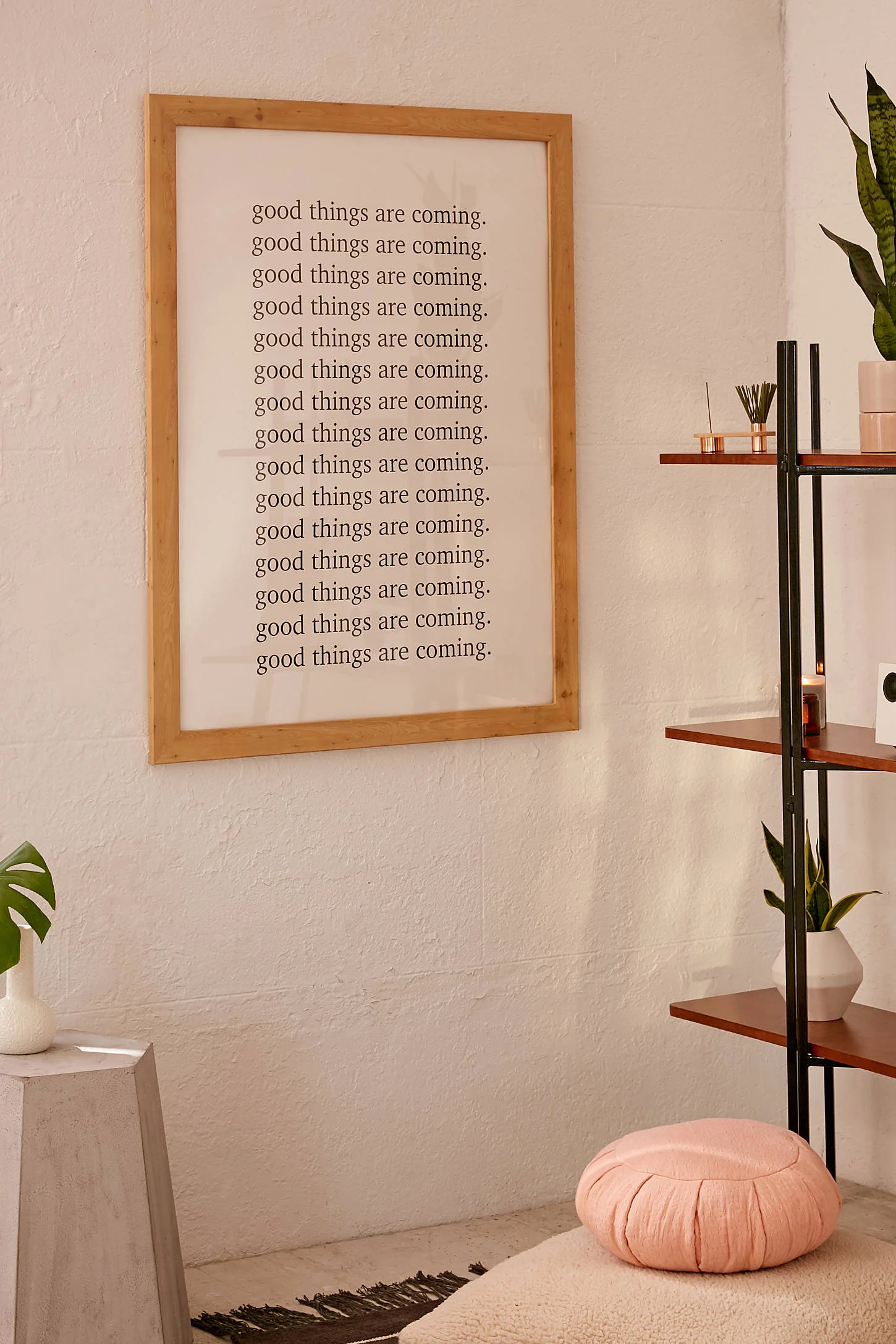
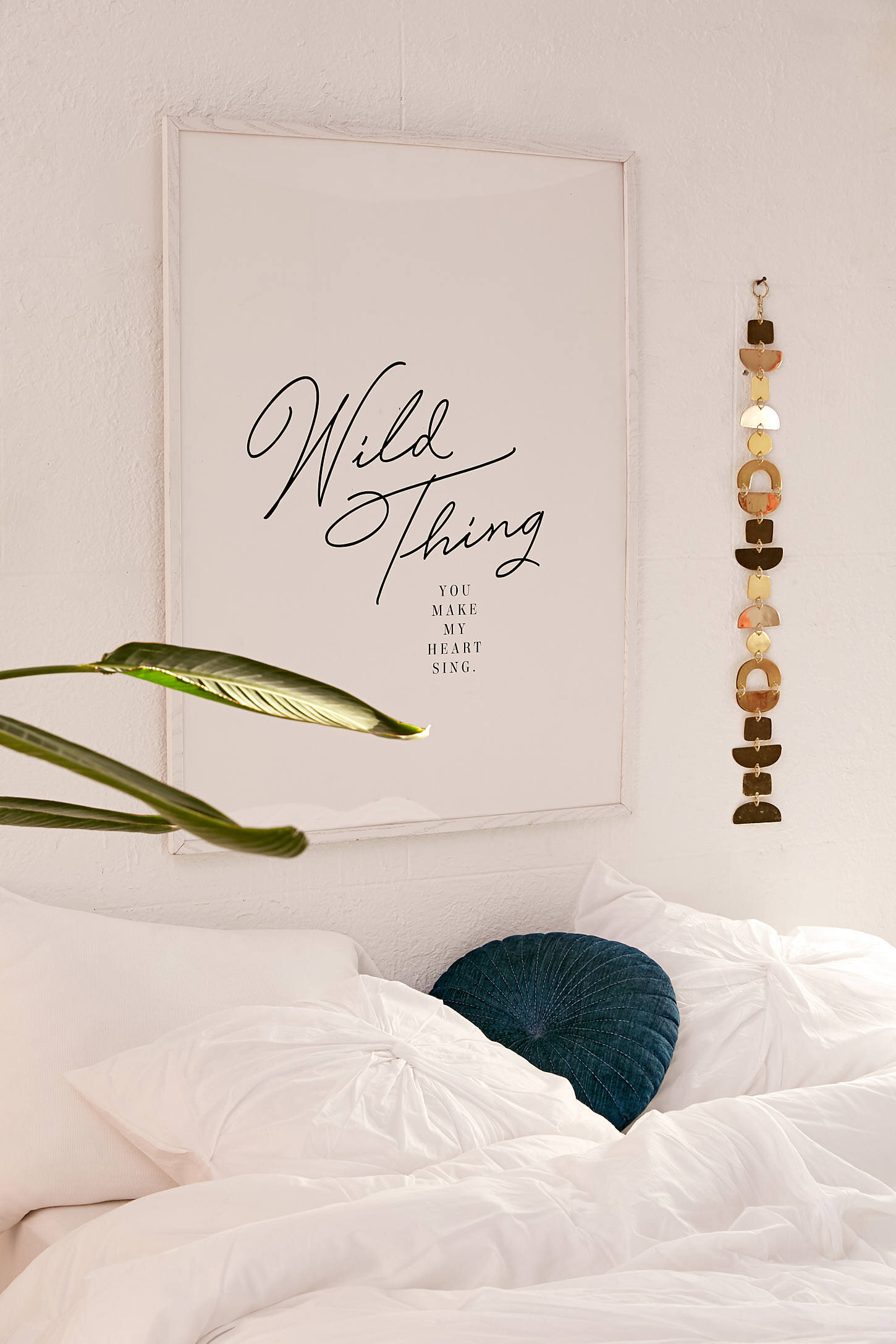
text Art Prints
Text or Word prints can serve as a statement piece alongside other prints! Along with the diversity it brings to your home, it also breaks up the monotony of pictures through out the house.
Word prints come in a variety of font choices that can change the vibe of each print. A serif font (the one with the things on each letter) is a total classic and is both familiar and comforting — like a good friend who always gives the best advice. While, cursive or stylistic fonts are more interesting and flowy — like your poetic college roommate who’s both vibrant and eclectic.
Both are beautiful and can be used to brighten a room and provide an interesting contrast!
I tried to pull a little bit of everything so you could see the different styles. Choosing any of these pieces would ensure that you have a total home-run and a super bright place!
What it pairs well with:
Most text prints are a good ad-on piece, and would look great paired with something more fluid and interesting. Think: your abstract pieces or a print with movement.
Text Prints round up


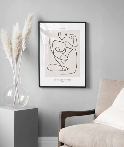
Line Art
Line art is a minimalistic type of art that holds so much elegance and beauty. Sometimes line art can be tricky because you have to balance the delicate-ness of a single line with the complexity of the entire silhouette. When done wrong, it can look either unfinished or overcrowded. When done right, it looks like the pieces I picked out.
My favorite type of line arts are ones featuring actual forms, as I think it makes a beautiful piece, so those are the pieces I normally lean toward.
What it would pair well with
This would pair well with another type of line art print or a block color print, or could stand alone if your style is more minimalistic. I love the natural wood frame because I think it adds a nice warmness to it, but this would also look good with a white or black minimal frame.
Line Art PRINT round up


And that concludes today’s home edit round up! I hope this was helpful and you found some pieces that you liked. If you have any questions, I’m here to help!
Which print was your favorite? Let me know in the comments below!
Stay inspired,
The Corporate Queen
—
When You feel yourself worrying
Psalms 32:7
You are my hiding place; you will protect me from trouble and surround me with songs of deliverance.
—
Other Posts You May Enjoy


A round up of the coziest living rooms that have us wishing we were snuggled up watching the Bachelorette.